Work performed under our Theory brand
Tools
- Mind Mapping
- Event Strategy
- UX Design
- HTML, PHP, CSS, Javascript
- Adobe Creative Suite
Deliverables
- Strategy
- Branding
- Collateral
- Website
- Package Design
- Interior Design
- Ephemera
- Photography
- Commercial
A brand refresher for 7-Eleven Hawaii
With 63 regional store locations in Hawaii and the power of a global brand, 7-Eleven Hawaii was falling behind in terms of modern design and reaching new demographics. Our goal was to bring a current look and feel to the brand while retaining their core brand elements. A current aesthetic was needed to attract more millennials and females to their customer base. We began with two-months dedicated to strategy and planning. Once we had a clear direction, we began to build out assets, collateral, interior and exterior signage, uniforms, packaging and along the way log everything in a living brand bible.
Brand Identity
Refreshing the local image of a global brand
The 7-Eleven Hawai’i logo is the most immediate representation of the company and its people. It is a valuable corporate asset that must be used appropriately in the proper approved forms. This version uses the original logo as a starting point. We pulled a design cue from the “7“ noticing that it does not connect but rather breaks, creating a distinct separation between the orange and red brand of colors. We worked to mirror this effect within the word Hawai’i; this visually and subconsciously connects the two elements.The minimal and modern logotype appeals to a younger demographic while retaining legibility with a bold, strong appearance. The descended cross bars in the letter “A“ and the horizontal bar in the letter “H” have been inspired by timeless type treatments. This logo is a perfect blend of classic Hawaiiana and the contemporary design culture. The ‘dynamic wave’ within the word Hawai’i serves many purposes. It conveys brand evolution, fluidity of its purpose and the ability to move in order to better meets its target audience.


Usage Examples


Secondary & tertiary colors selected to open up the brand palette.
Our team decided to open up the brand and free it from the old stale tones of the unchanged 7-Eleven brand. We used these colors as accent tones over a primarily white canvas to breath subtle life into packaging, collateral, advertising, and web platforms.


Photography
The 7-Eleven Visual Style
The brand imagery creation involves a system that allows for the combination of aspirational, conceptual imagery and dynamic lifestyle photography that is authentic, meaningful, and immersive.


Branded Merchandise
Uniforms & Ephemera for the 7-Eleven Lifestyle
We believe that apparel is an important and personal way for 7-Eleven Hawai’i to make themselves approachable to the customer and a nice way to personalize a relationship between a brand and their patron.
We wanted to create a look that not only paid homage to island traditions but also would be comfortable to wear both on the clock and while outside of work hours.

Commercial
We worked to design a script and visual tone that spoke clearly and was engaging for millennial women. We did away with the majority of branding and pure old world advertising and simply focused on the story. In this case, a young girl, caught in a romantic scavenger hunt.
We felt that creating a promotional piece that simply told a story, was at the heart of the 7-Eleven mission. Their aim is to give people a break from their hectic work day. The last things people want when they unwind is to watch an on tv, so we created a story that people can get lost within.
Distribution
Film & Television
Runtime
One Minute
Our Process
Planning
Budgeting
Screenwriting
Storyboards
Previs
Production
Post Production
Sound Design
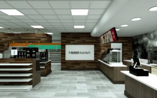
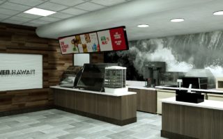
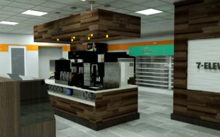
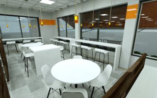
Interior Design
7-Eleven Interior Spaces with the Customer in Mind
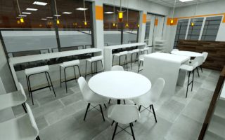
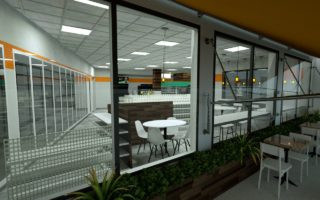
Revitalizing a brand is not just about the logo and colors. It is about the layout, design, and atmosphere that every customer will experience. We wanted to increase the perceived value of the brand, remove the clutter, and bring in a familiar feel. So, we covered everything in reclaimed wood. We lifted the ceilings and widened the space between shelving units to open up to space and encourage freedom to browse. We also created a section of the store that focused on the coffee and pastries and for the first time ever established a place for people to sit indoors and outside on the patio.


